Cropsolutions - A redesign from start to finish
Read about my approach to make a customer feel confident in their website again and to help farmers find their way in a big assortment of agricultural products.
About the client
Name
Cropsolutions
What they do
Equip farmers with agricultural products and knowledge. Cropsolutions is a Wikipedia for farmers.
Problem to solve
Improve site structure and create a more appealing website since the customer wasn’t satisfied with current website. There were doubts about the site and page structure, the website wasn't responsive, flexible nor inviting.
Deliverables
Process
Taking inventory of the content on the current website
Discovering all their products and getting a feel for the amount of content and its hierarchy by checking each page and noting their goals in Excel.
Establish a suitable content structure for the targetgroup
Conducting proper user research wasn't an option so I immersed myself in the farming world by asking questions and looking at similar websites. I investigated possibilities to improved the site structure , to conclude that the current structure was fine although the terminology should be more accessible and visual presentation enhanced.
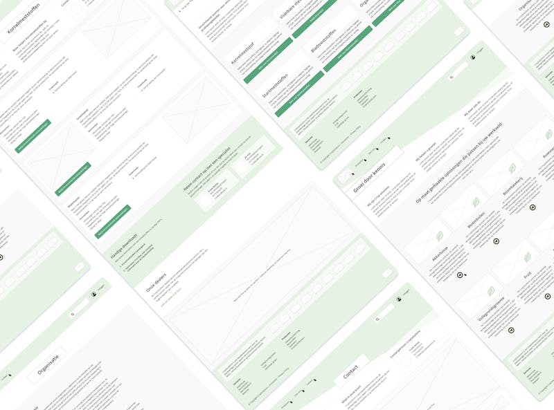
Create wireframes based on content structure
In this phase I created different kinds of page types based on design patterns and acquired knowledge about farmers. Each page type is constructed of reusable components. Sector pages assists users that want to roam trough products that are specifically meant for their agricultural sector. The page with the main product categories is suitable for users that aren't tied to a certain sectors and wants to have an overview of the products that Cropsolutions provides.
Brainstorming and getting inspired for a fresh new look and feel
Gathering inspiring images as reference.
Create visuals based on ideas
The old styling did not pass the 2019-vibe check. Instead of the website feeling like a physical flyer, it had to look like a new website from this era with a much fresher first impression. The wireframes were 'colored in' and readability and the Gestalt principles where kept in mind while trying out different options.
Prototype visuals for demo purposes
The visual design was demonstrated using a clickable prototype, mimicking how the website will work. Small changes were made based on client feedback. Prototype.
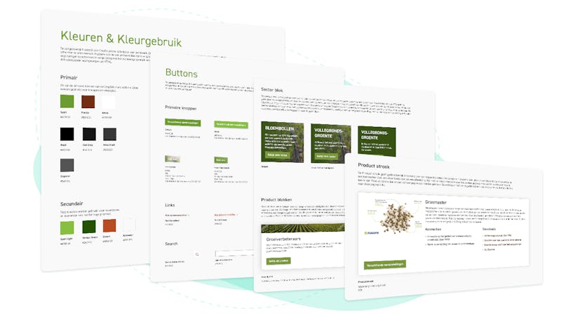
Deliver a styleguide for Front-end
When the visual designs were approved a styleguide was made primarily for the developer but also for the web editors since they're also users of the website.
Delivery client & onboarding
I helped web editors navigate within the new content management system and described each component.
Insights
As said by Picasso: "Good artists copy while great artists steal". Everything created today is inspired by something in the past.
As soon as something becomes clear, proceed to the next step. It's not always neccesary to completly finish a step.


